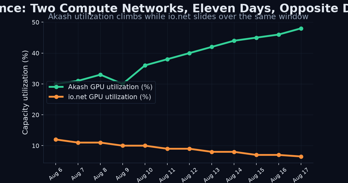
Between August 6 and 17 we measured both halves of the capacity-utilisation ratio — registered supply AND capacity actually in use — on the handful of networks that publish both. The result is the kind of finding node counts are structurally unable to show:
- io.net: registered devices +23.9% (2,196 → 2,722). Compute-hours
- Akash: fleet shrank 5–7% while demand surged — GPU utilisation
A dashboard ranking these two by node growth inverts reality.
What the Numbers Mean
The Practical Takeaway
For anyone provisioning compute or allocating capital, this is not an academic observation. It means a fleet-growth dashboard will systematically mislead you:
- If you route jobs by node count, you will send work to io.net-style fleets growing their registered base while shrinking actual deliverable compute.
- If you route jobs by utilization, you will correctly detect that Akash's shrinking-but-tighter fleet is where demand and pricing pressure actually are.
Method and Caveats
We measured registered supply and capacity actually in use on the handful of networks that publish both, across a fixed eleven-day window (August 6–17). This is a single-window observation, not a trend — we flag it as such rather than extrapolating. We also handle intraday swings by using daily snapshots, excluded one frozen counter we could not reconcile, and declined to publish a fill-rate figure we could not verify to our own standard.
The reason to be this explicit about caveats is that these are our own numbers, and the whole point of the product is that every figure links to the network's own public endpoint. Check us in one click — that is the product. The divergence case study is not a claim to be taken on faith; it is an invitation to verify.
The two networks moved in opposite directions over the same eleven days, and neither direction is what a node-count dashboard would tell you.
io.net grew its registered fleet nearly a quarter — yet delivered zero additional compute-hours. Registered growth with flat delivered output means the new devices are not being absorbed into paying work. Running clusters fell almost 38%, and utilization dropped from 57.3% to 44.6%. In short: more hardware advertised, less of it busy. Anyone reading only the "+23.9% registered devices" headline would conclude io.net is thriving. Akash shrank its fleet 5–7% while GPU utilization nearly doubled (31.6% → 61.2%). A smaller fleet doing more work is the signature of a tightening, healthy market — demand exceeding available supply. A node-count dashboard would flag Akash as shrinking while the underlying economics improved dramatically.Why Node Counts Invert Reality
Both of these findings are structurally invisible to a pure node-count lens. Node count conflates registered with active and ignores whether anything is busy. The capacity-utilisation ratio — the pairing of registered supply with capacity actually in use — is the number that separates a growing fleet from a growing business.
This is precisely why we measure both halves of the ratio on every network that publishes them, and why our canonical schema exposes registered, active, and utilization as distinct, unit-declared concepts. The divergence case study is not an edge case; it is the normal state of a DePIN sector where supply and demand move independently.
Full write-up with method, daily paths, and every caveat we could find in our own numbers (single-window disclaimer, intraday-swing handling, a frozen counter we excluded, a fill-rate we refuse to publish and why): the divergence report.
Every figure links to the network's own public endpoint. Check us in one click — that is the product. API access.
---
Try it yourself
Query the live catalog, supply telemetry, and provenance receipts directly: /v1/networks, /v1/supply on the REST API.
Related reading: DePIN analytics pipeline · what to evaluate in a DePIN data platform · depin data api vs on chain analytics which is better · how AI agents buy DePIN data
Design-partner seats are capped at 20 at a lifetime-locked $199/mo (full API access, every published endpoint, MCP server, Bitcoin-anchored provenance). After seat 20 the price becomes $249/mo. Claim a design-partner seat → · See pricing---
Get Started With DePIN Intelligence
Kairos Signal provides verifiable, provenance-first telemetry for DePIN networks, including first-party supply data read directly from a network's own API or blockchain. Every value carries a verify_url you can check yourself, and each daily batch is Merkle-rooted and anchored to Bitcoin.
Every API response is signed with ed25519 and timestamped. You can prove what was served and when, months later. That is what we mean by provenance-first.
Related reading: DePIN Intelligence Guide · DePIN Telemetry · How to Query DePIN Data · DePIN Data Verification · Pricing